Statement of intent
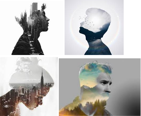
My chosen theme is portraits. I have chosen this because I am interested in making double exposure portraits. For research I intend to look at other portrait photographers who have done double exposure so then I have examples to look at when I am stuck. An example of a double exposure photographer is Dan Mountford. The location I intend to do this shoot is the studio because I have all the equipment I need.
There are many styles of portrait. An example of one would be traditional. Traditional portraits are just pictures of people looking at the camera. In these pictures the people are showing expression, personality and mood depending on the situation. More styles would be surreal, lifestyle, environmental, conceptual and fine art.
I intend to take some pictures in the studio and some outside because I will have a variety of pictures. This will make it easier for me because I will have a lot to talk about whilst doing my best and worst. For my studio shoots I will need a camera, a tripod, artificial lighting and a background. For my outside shoots I will need a camera. The camera settings I will use will depend on what type of shoot that I am currently doing and the lighting of the location. This means that I will constantly have to check the quality of my pictures to make sure that they are at the standards I have made for myself. An example of an outside location is Salford Quays/ Manchester.
I plan to use photoshop when I edit my photos because it’s easier to use and less time consuming. For some of the pictures I intend to make parts of the picture stand out to the rest of the picture to attract more attention to it. This is because viewers will be grasped by the anomaly in the photograph and question why this has happened.
I intend to make double exposure edits because it’s complicated and it will get me a higher grade. I have always found double exposure interesting because it makes me wonder how photographers manage to get two different photos and put them together. Also I will be looking at mental health because I believe that it’s not taken seriously enough in society.
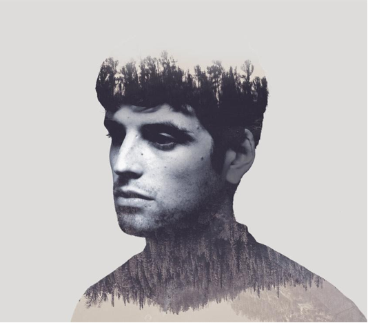
In this image double exposure has been used. There are trees on the man's head and trees from the man's neck down. Between the two tree landscapes the man's face is shown and he is looking away from the camera. The trees have been reflected from the top of his head onto the neck down. This gives the viewer the impression that there’s water there and it looks more natural. My interpretation of his facial expression and the colours are that he is depressed and wants to be alone. The angle that his face is at gives the impression that he wants to be left alone with his thoughts. The colours are dark and gloomy and from that I can tell that the model is upset or has been hurt badly. The background is plain so that we can see the clouds and mountains behind the trees. The trees have texture in them because they have a different appearance. The background contrasts with the face because it's white and the outline of the face is black. The lighting adds a shadow to the eyes and it makes you wonder if the man is hiding his tears or his guilt.
I can see that the man is in the foreground. The photographer has used leading lines near the left side of the man and there are no sweet spots in the photo. The viewpoint that has been used is eye level and it impacts the picture by making people look at the man as if he is right in front of them. The f stop used is f/5.6. I know this because the man is in the foreground of the picture and a smaller f stop is needed if a close up has been taken. In my opinion I think an ISO of 400 has been used because there is no noise exposure in this image. I think the photographer has reduced the noise level in the image on photoshop because he needed the picture to have a certain level of noise before he could turn his work into double exposure. The white balance used is cloudy because the image is dark and a bit bleak. If I was doing this edit I would use a brighter white balance like daylight because it brightens the mood of the picture and probably the model. The photographer has used Rule of Thirds to make his picture better. I know this because the model is in the middle of the picture and the area around him is empty. In my opinion the photographer has done this on purpose because they wanted to stand out. I think that the photographer has used a tripod to make sure the photo is in focus. The photo has been manipulated on photoshop and the photographer has used layers to make it a double exposure. The main colours in this image are grey and black which suggests that the mood is murky. There are no patterns in the image. The photographer cropped the image by getting rid of some of the man's hair and got rid of his upper body but kept the outline of it. In the photo there is nothing that frames the image. The man's face contrasts with the trees because they are two different colours. The top part of the head shows trees from a dark forest, the face represents emotion and the bottom part with the trees and mountain represent a mountainous area with a forest. The colour of the trees is making the viewer wonder why they are a dark shade. They contrast with the man's face and the clear background because black and white aren’t complementary colours as they are not on the colour wheel. It could be that it represents his feelings or the photographer is just fond of contrast.
I like their work because it is something that I would like to do. The photographer used double exposure to make this an interesting photo and get people's attention. Their work links to mine because I am also doing portraits for my current project in photography. The strengths in this image are that the trees are on top of the man's face but also beneath his face. In my opinion the bad thing about this picture is that the border is too wide on the left side and it should be cropped all the way up to the shoulder.
One day I hope to achieve this image because it is what I am aspiring towards. I want my outcomes to be very similar to this image but I want to use man made texture as well as nature. I can use this image to inspire my outcomes by magpieing ideas from it and using it on my own images. I would have to make sure the layering of the picture is up to the standard of making a double exposure edit. For my camera settings I will experiment with the ISO and make sure that there is no noise in the picture, white balance to see which is best and F/stop to see if I want my foreground, midground or background out of focus.
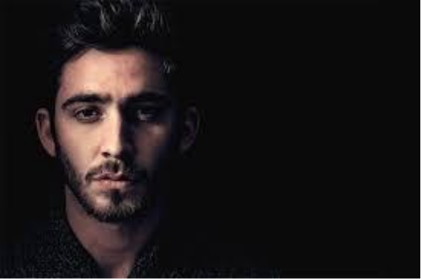
This image is a close up and I know this because there is no foreground as that’s where the model is standing. Only middle ground and background are visible. I can see a man standing next to the darkness which could symbolise that he is all alone. The light shining on his face could symbolise hope and that he can be saved from the lightlessness. My interpretation on the colours and his facial expression are that something is eating him up but he doesn’t want to tell anyone.
The use of foreground is visible in this photo. There are no leading lines shown anywhere in this image but the photographer has used the rule of thirds in this picture so that there is some composition. I know this because the man is standing on one side of the photo. The viewpoint is eye level and the impact is that the man stares back at us when we look at the photo like he’s looking into our soul. In my opinion an f stop of f/5.6 has been used as this is a close up portrait. I think an ISO of 800 has been used because I can see some noise exposure. The white balance used in this image is shadow because there is mostly darkness in the background. In my opinion the image is overexposed because of the ISO. I think the photographer used a tripod to keep the camera steady and to make sure the image is in focus. The image has not been manipulated in photoshop because there is no blend or anything obvious to tell if it has been or not. The main colour in the picture is black and it suggests that the atmosphere is gloomy or frightening. There aren’t any patterns in the image so it’s very simple. The image has been cropped by adding a complete black layer behind the man. There are no objects in the photo that frame this image because the photographer wants us to focus on the man.
I like the photographer's work because of the way they have used the rule of thirds and made the background completely black which makes us wonder if anything is in the darkness apart from the man. Their work links to mine because I am also doing portraits in photography and I can use this as an idea. The strength is that the rule of thirds has been used because it’s a compositional rule. The only weakness is that some patterns could be added to it so that it attracts more people to look at it.
I hope to achieve this photo one day because it’s a very interesting technique. I want my outcomes to be similar to this image but with contrasting colours and patterns so that it attracts more eyes and makes people wonder what it’s all about. I can use this image to inspire my own image by magpieing some ideas and changing them a bit to make it my own work so then it’s like my own version of this portrait.
Dan Mountford
Dan Mountford was born and raised in Milton Keynes. He currently lives in Brighton where he studied graphic design at the University of Brighton. He is a freelance Graphic Designer and photographer and works with a variety of disciplines including photography, illustrations, editorials and motion design.
Interview: https://www.thephoblographer.com/2015/12/05/daniel-mountfords-double-exposures/
Dan Mountford said in his interview: "I was really inspired by more abstract photography than conventional. The Holga camera and the work i was seeing on Flickr definitely first inspired me to create double exposures. I was making photo collages around the same time in Photoshop, which often combined a scene and person and I realised the way the lights and darks were blending together worked in the same way as double exposure so there was a bit of inspiration from a trend in a different medium at the time."
Dan: "Whilst studying Graphic Design at college, I took a darkroom techniques evening class and my interest in photography started there. I was developing negatives from an all plastic Holga modified to fit 35mm film. The camera leaked in light easily and had a soft focus dreamy feel to it and was great for double exposures. I’ve never really considered myself to actually be a photographer, but I definitely like experimenting with process in the medium."
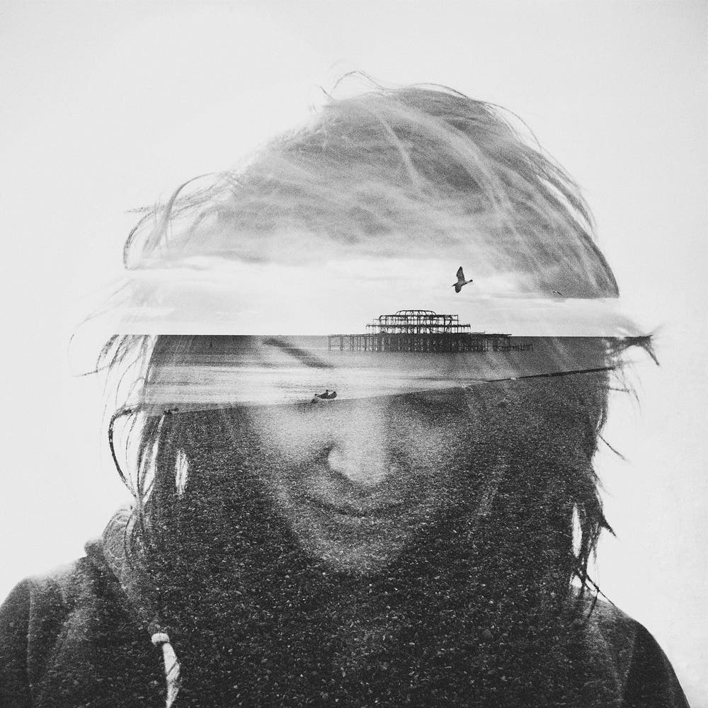
The coastline in the middle of the picture represent leading lines because they lead your eyes across the woman's face. The foreground shows a pebble beach across the nose and mouth of the face whereas the background of the sky and clouds fade into the woman's hair. The leading lines of the horizon leads your eyes to the focal point of the image which a silhouette of a broken down pier. I think Mountford used a tripod to keep the camera focused on the woman. I think the ISO used in this photo was 500 because there is no noise exposed. The f stop used in this picture was f/16 because the whole picture is in focus. The white balance used was a cloudy because the picture is dark, overcast and a bit mysterious. This is because the coastline is dark so the picture of the model needed to be dark. Both images are black and white on the double exposure. The lighting set a dark mood and the picture seems to have a little gothic theme.
This is different to the other double exposure portrait (first analyses) because there is way more detail and you can tell much more time and effort has gone into making this. This also makes the viewer wonder why Mountford chose to use the remains of a pier with a upset looking woman. Is it to show how she feels inside? Or did he combine two random pictures together for fun?
I like Mountford’s work because of the double exposure. His work is linked with mine because I am doing portraits in photography and I want to try and achieve double exposure. In future shoots I would take two photos and edit them together to create double exposure.
Dan Mountford was born and raised in Milton Keynes. He currently lives in Brighton where he studied graphic design at the University of Brighton. He is a freelance Graphic Designer and photographer and works with a variety of disciplines including photography, illustrations, editorials and motion design.
Interview: https://www.thephoblographer.com/2015/12/05/daniel-mountfords-double-exposures/
Dan Mountford said in his interview: "I was really inspired by more abstract photography than conventional. The Holga camera and the work i was seeing on Flickr definitely first inspired me to create double exposures. I was making photo collages around the same time in Photoshop, which often combined a scene and person and I realised the way the lights and darks were blending together worked in the same way as double exposure so there was a bit of inspiration from a trend in a different medium at the time."
Dan: "Whilst studying Graphic Design at college, I took a darkroom techniques evening class and my interest in photography started there. I was developing negatives from an all plastic Holga modified to fit 35mm film. The camera leaked in light easily and had a soft focus dreamy feel to it and was great for double exposures. I’ve never really considered myself to actually be a photographer, but I definitely like experimenting with process in the medium."
The coastline in the middle of the picture represent leading lines because they lead your eyes across the woman's face. The foreground shows a pebble beach across the nose and mouth of the face whereas the background of the sky and clouds fade into the woman's hair. The leading lines of the horizon leads your eyes to the focal point of the image which a silhouette of a broken down pier. I think Mountford used a tripod to keep the camera focused on the woman. I think the ISO used in this photo was 500 because there is no noise exposed. The f stop used in this picture was f/16 because the whole picture is in focus. The white balance used was a cloudy because the picture is dark, overcast and a bit mysterious. This is because the coastline is dark so the picture of the model needed to be dark. Both images are black and white on the double exposure. The lighting set a dark mood and the picture seems to have a little gothic theme.
This is different to the other double exposure portrait (first analyses) because there is way more detail and you can tell much more time and effort has gone into making this. This also makes the viewer wonder why Mountford chose to use the remains of a pier with a upset looking woman. Is it to show how she feels inside? Or did he combine two random pictures together for fun?
I like Mountford’s work because of the double exposure. His work is linked with mine because I am doing portraits in photography and I want to try and achieve double exposure. In future shoots I would take two photos and edit them together to create double exposure.
Mood boards


Plan for shoot
Name: Muhammad Tauseef Mukadam
Project Title/ shoot number: Shoot 1- Sportswear
Description of aims for shoot: For this shoot I aim to take photographs of models in sportswear holding sports equipment
Links with Photographers: I wish to take pictures like Lorenzo Agius
Location: Pexa
Props/ items needed: Sport equipment
Kit needed e.g. lighting, tripod, backdrop, macro lens: Camera, backdrop, lighting
F-Stop : F/5.6
White Balance: Shade
Shutter speed: 1/400
ISO: 800
Which compositional rules will I use?
I will try my best to use rules of thirds, leading lines, birds eye view and worm's eye view. This is because they will make my pictures more interesting and detailed. I will ask my model to act like he is doing the sport. For example, when he is holding a rugby ball I will ask him to make it look like he is throwing it.
Portrait
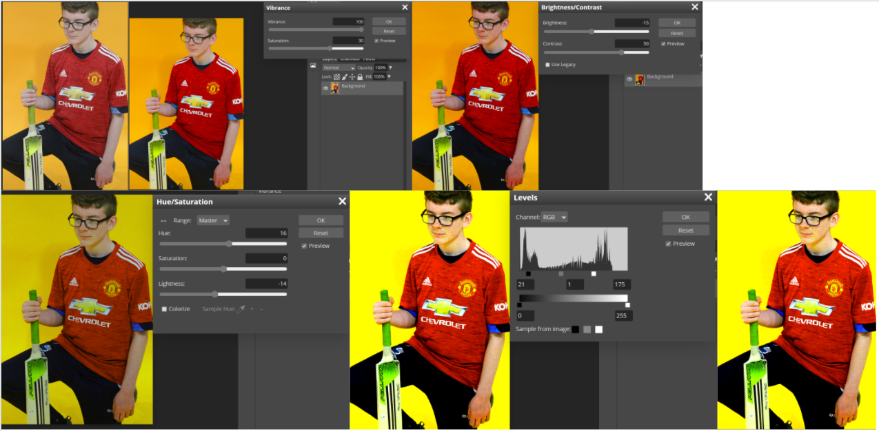
Cricket


Best photo
This is my best photo because it's in focus. For this picture I used an f stop of f/5.6 and an ISO of 800. My shutter speed was 1/400 and my white balance was shade. The colours contrast against each other. For example, the red and the blue jogging bottoms. The red T-shirt contrasts the green o0n the cricket bat. The light is shining on the models face and casting a shadow on the background. Next time I do a shoot like this I'll try to get the rest of my models hair in the picture.
|
Worst photo
This is my worst photo because it's out of focus. For this I used an f stop of f/5.6 and an ISO of 800, I should have used f/11 because my picture would be more focused and I could have got all of my models body into the picture. Also I should have used a tripod to keep my camera still. My shutter speed was 1/400, my white balance was shade when I should have used daylight because I was using lights. Also to improve this picture I should have stood still so that my camera focused on my model.
|
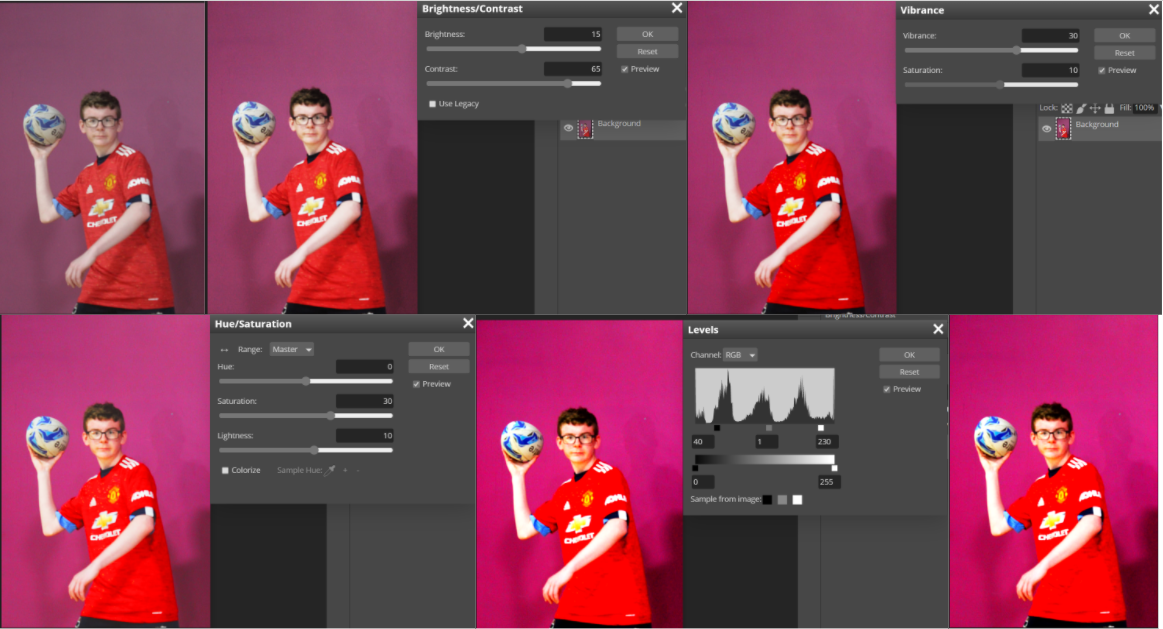
Rugby


Best photo
This is my best photo because my model is in the middle ground and the shot is bright because I've used the correct white balance and my studio is well lit. The central focus point of the picture is the rugby ball because my eyes are attracted to it. The lighting on the left hand side makes shadows of the model on the right side. The picture is asymmetrical because he has rugby ball in one hand and nothing in the right hand.
|
Worst photo
In this photo I could have had my model in the middle ground. Also I could have used a faster shutter speed and a tripod to keep my camera steady and focused. For my f stop I could have used f/16 to capture middle ground instead of f/5.6 and an ISO of 800 to decrease the visual noise. Furthermore there are no compositional rules so the picture isn't as eye-caching as it could be.
|
Badminton


Edits
Mood board for Justin shoot
Justin shoot (setting up)


Justin shoot


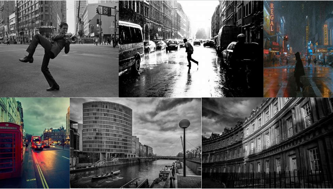
Street photography mood boards

Salford Quays trip
War museum


Best photo
This is my best photo because it has compositional rules in it. One of the rules I used was worms eye view and it makes the photo more interesting because my model looks like he's towering over everyone. My model looks serious which also makes the viewer wonder why he's like that. There are leading lines behind my model which lead the viewers eyes to him which is a good thing because it's a compositional rule and everyone's attention turns to the model.
|
Worst photo
This is my worst because it's simple. There are no compositional rules in it which makes it basic and there is nothing to keep the viewer hooked in. My models eyes are almost closed which makes the viewer wonder if he's falling asleep. I used an ISO of 1600 and I know this because there is visible noise in the picture. My eyes aren't drawn to the model but the vent behind him which is a bad thing because it was not the goal of the photograph.
|
Quays


Best photo
This is my best photo because I have used the rule of thirds. There is also leading lines along the brickwork my model is sitting on and along the railing in the background. The F stop I used in this photo was F/16 because everything is in focus. I used daylight for my white balance because I was outside.
|
Worst photo
This is my worst photo because it's out of focus. It also has no compositional rules at all so it's pretty basic and my model has his eyes closed so that means he wasn't ready. I probably used a longer shutter speed because the image is blurry as the model was moving whilst I released the shutter. I should have used a smaller F stop to get the foreground in focus.
|
Fairy Garden


Best photo |
Worst photo |
|
This is my best photo because I have used worms eye view and rule of thirds. This is important because it makes the picture more interesting and makes the viewer intrigued by it. The F stop I used in this photo is F/11 because the foreground is in focus and the background is out of focus. My white balance setting for this was daylight as it was a sunny day and we were doing the shoot outside.
|
This is my worst photo because I used the wrong white balance. The white balance I used was daylight even though it was cloudy and it made the picture too bright. The F stop I used was F/16 because it's almost out of focus in the foreground where my model is stood.
|
Lowry


Best photo
This is my best photo because it has leading lines and the colour of the metal contrasts to the dark colours my model is wearing. The gaps between each piece of metal represents the leading lines which attracts a lot of attention. The F stop I used in this picture was F/11 because it's a close up and everything is in focus. The white balance I used was daylight so that the picture was bright enough to use.
|
Worst photo compared to a good photo
The picture on the left is my worst image because it's too bright. The white balance I used was daylight which made it too bright and that's what ruined my picture. I used a small F stop because it was a close up. The F stop was F/11 and that meant everything in the close up was in focus.
However, the picture on the right is one of the best images because I used the correct white balance which was shade. This made sure that the image wasn't too bright but not too dark. My aperture was an F stop of F/11 and I know this because the midground and background are in focus. I sued an ISO of 800 because I didn't want any visible noise in the picture. |
Double exposure
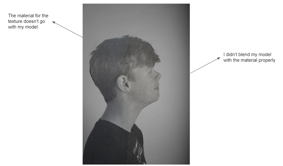
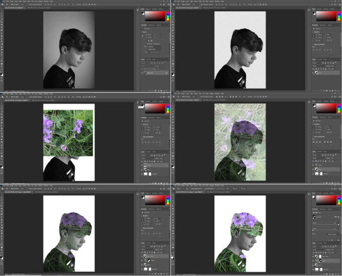
I used the wrong material for this picture. It didn't blend correctly and the whole picture messed up.
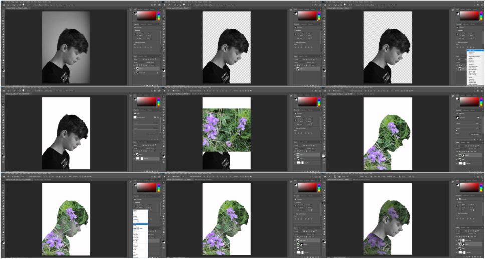
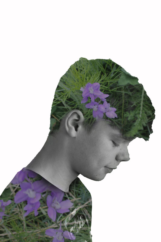
For this edit I used flowers because it was easier to use and blend with my model. Unlike my previous attempt with the metal the flowers are also visible and make the double exposure more lively.
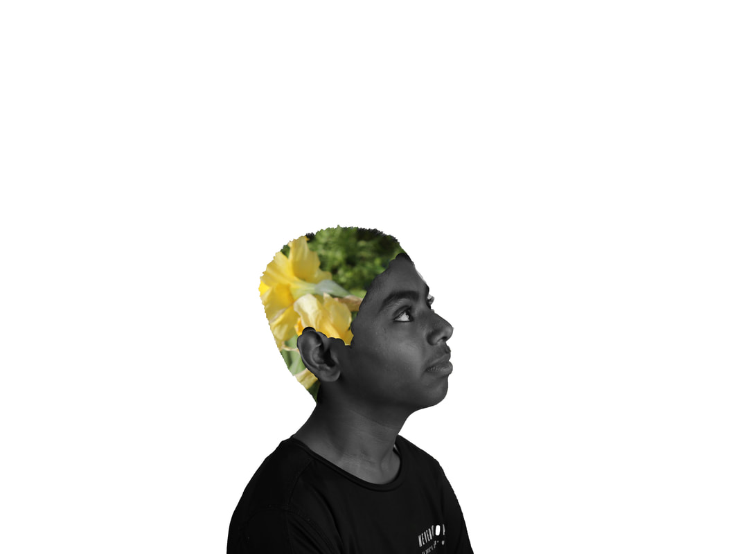
For this I used yellow flowers so that the models hair contrasted with the rest of the picture. I got a picture of yellow flowers and edited it into his hair. I had to use a paintbrush tool with the opacity at 100% so that his face would show.
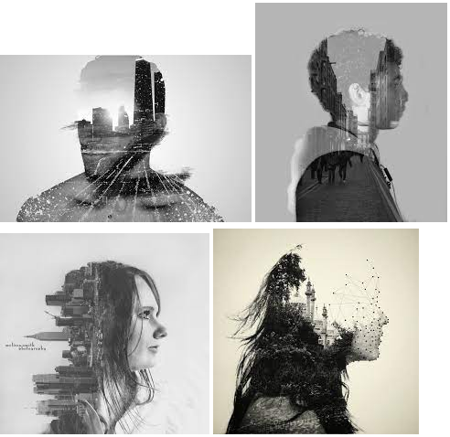
Conceptual portraits
Brunel Johnson mood board
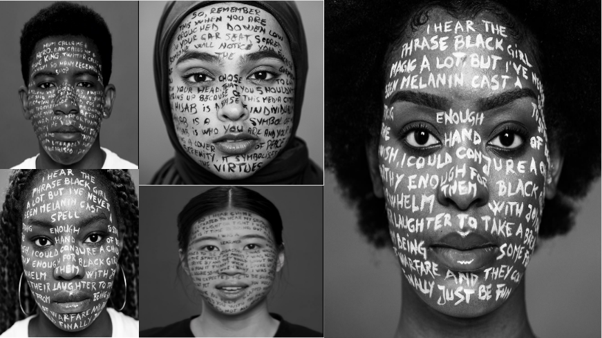


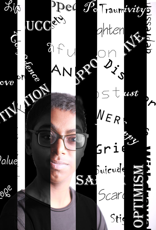
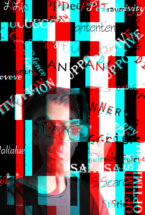
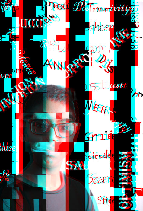
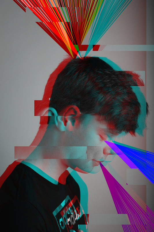
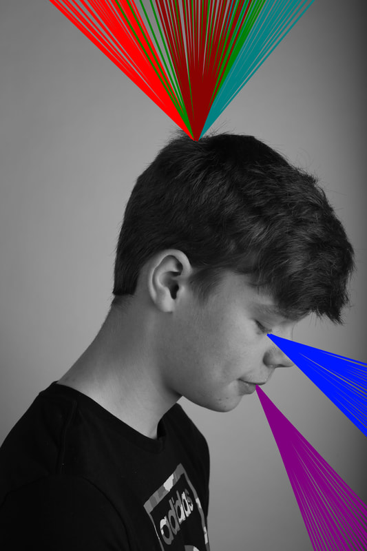
I have done these edits for metal health awareness. I have chosen to do this because there are millions of people whose mental health is really bad and we don't seem to notice it. The glitch shows that people suffering from mental don't how to feel because they have a lot of mixed emotions and it also shows that they sometimes feel like they are all by themselves because no one cares about them. The green and red are complimentary colours and they clash. This represents what it's like inside someone's head when they're suffering from mental health issues.
Nick Dolding mood board
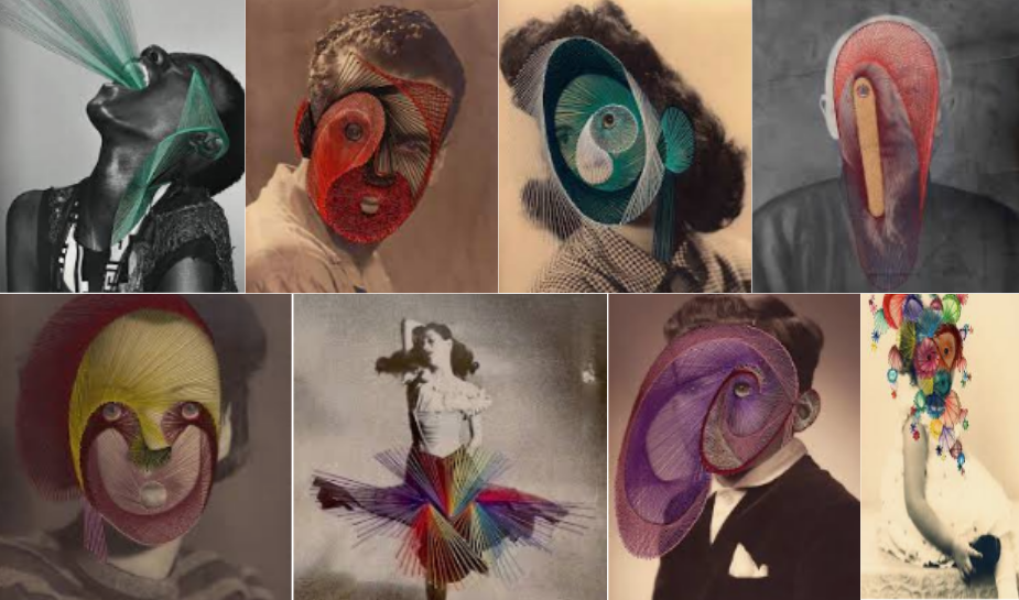
Maurizio Anzeri
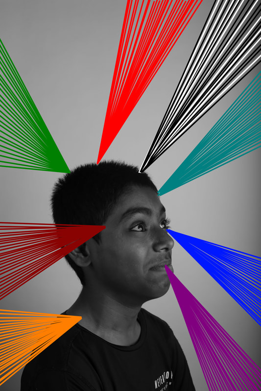
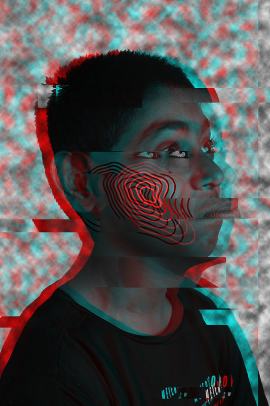
This picture represents all of the different types of mental health in their colours. The tool I used was the line tool and I changed the colour of the line every time I went to a different area of the image. I drew this by hand because it was easier and it gave me the option to change it around if I didn't like the style.

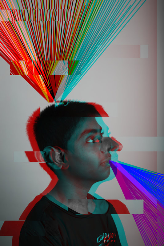
In this edit, the exploding colours on the top of his head show the viewer that his emotions are out of control. I used the line tool and rotate and scale on the transformation options to get the picture like this. I have done this to show that not all people can control their mental health and everyone should look out for them and help them in any way possible.
Combination edits
Mock edit
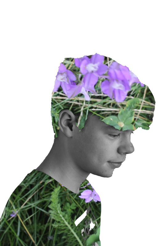
In this edit I have taken a picture of flowers and combined it with a picture of one of my models. The edit is called double exposure because it's the combination of two pictures to make them look better than they already are.
Final gallery
|
|
|
Evaluation
When I started my portrait project it was based on sportswear and I found it interesting because there were endless options. I enjoyed taking photographs because there were so many different types of pictures I could take and get my models to stand in the positions that suited them and suited the pictures I was taking. I researched Dan Mountford for my double exposure project because his work was really good, Brunel Johnson for my conceptual edits because his work was inspiring and Maurizio Anzeri for my lines project because his work was the best that field for edits. They have influenced my photographs in many ways. An example is when I researched about Dan Mountford and I knew that I had never done anything like that and I was hooked into it. In my opinion, the Salford Quays shoot was the best shoot I did because there were so many places to take pictures with my model and many different angles to play and experiment with. The only problem I encountered was when I was doing my first edit of double exposure because it was a bit tricky and I managed to do the whole edit wrong. I overcame this by taking my time with the edit and looking at the potential steps I didn’t do correctly and correcting my mistakes. If I had the chance to redo the project I would redo the sportswear photoshoot because most of the pictures are out of focus and I would probably do it outside with more natural lighting. This is because I want the pictures to look more natural and I would like to add nature or a sports center into background.
The outcome of my edits were excellent because I took time on them and experimented on them to see how I could make them better than they already are, but also to make a little bit of the work my own. For example, my glitched edits looked a bit plain so I combined it with my conceptual lines edits and made them look meaningful. I presented each one as a single edit, but in the same place, to show how they are different but also the same.
The outcome of my edits were excellent because I took time on them and experimented on them to see how I could make them better than they already are, but also to make a little bit of the work my own. For example, my glitched edits looked a bit plain so I combined it with my conceptual lines edits and made them look meaningful. I presented each one as a single edit, but in the same place, to show how they are different but also the same.
